Thursday, August 23, 2007
Elaine Summers
The Hidden Forest
August 23 '07, New York City
Choreographer: Elaine Summers
Dancers: Dale Andree, Joshua Bisset, Harriet Bograd, Meg Chang, Jessica Higgins, Kiori Kawai, Thomas Kortvelyessy, Laura Quattrocchi
Composers/Musicians: Pauline Oliveros, Jay Clayton, Thomas Houser, Carman Moore, Ann Hurley, Lotte Arnsbjerg
Artists: Alison Knowles, Davidson Gigliotti, Murphy Gigliotti, Taketo Shimada, Laura Quattrocchi, Miana Grafals
Assistant Choreographer: Rebecca Loukes
Budget/ Accounting: Debbie Goldberg
Production Designer: Murphy Gigliotti
Organizational Consultant to Miss Summers: Meg Chang
Communications: Jonathan Gill, Cody Hughs
The influential intermedia artist Elaine Summers performed her new work “Hidden Forest” at Lincoln center on August 23rd during twilight. I was one of the eight diverse dancers to participate in the alcove of trees and inside Elaine's images of dancers floating among the leaves and weather balloons.
During the previous months Elaine began the process in her loft with balls of many shapes, sizes, textures and colors. I often felt that her in depth anatomical and healer’s knowledge could scale to a planetary dimension. She would work with a dancer’s injuries and then spark their kinesthetic imagination. Elaine innovated much of her vision within the framework of the unique qualities that each dancer had. She spoke many times of Dante, of a hidden forest, which inspired her work:
“Midway in the journey of this life
I came upon a dark forest,
Where the path was lost.”
As time rolled by she mesmerized us as only Elaine Summer’s can as we watched her visions of forest and creatures from our context. We were visible and invisible, darting and spinning, and images or sparkles seemed to flash by.
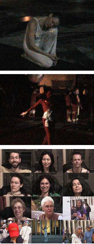
She is a wonderful dancer.
Tuesday, August 21, 2007
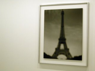
Hiroshi Sugimoto, " Eiffel Tower" 1998
“Airs De Paris”
25 April-15 August 2007
Centre Pompidou
www.centrepompidou.fr
Reflections: Angie Eng, Media Artist New York City
Installed in Paris for summer 2007
Rule number 1 in the Age of the Curator: When experiencing an institutional art show consider the text on the wall as yet another art piece. Wall text describes this is a show about Paris OR the chosen artists work/know/visit/ live in Paris. The latter more prevalent when one considers the artist roster. I recommend the visitor experience these blocks of black symbols like New York City parking regulation signage that leaves the driver in stop-motion perplexity. And parked at the entrance sits Orozco’s redesigned, re-functionalized Citroen 1970. Put the hit on the first or second track. But as we all know the true gems are really on the B-side. However, if we skip the introductory room where the actual cherry sits amongst distracting black ceiling goo and the reduction of On Kawara’s ‘Today Series’ you will be welcomed with Pierre Huyghe’s simulacra photo of Gordon Matta-Clark’s 1974 film screened on the adjacent wall. Unfortunately, we don’t get to experience one of Matta-Clark’s exterior desecrations, however one will soon discover that the exploding real-estate market has permeated the museum walls and each artist is slotted about 10 square meters. My impression that European shows are much more sensitive to giving the art object critical space in between, went out the door. Being a New Yorker with bionic over-sensory filters, I could adapt to the occasion and enjoy a few select œuvres.
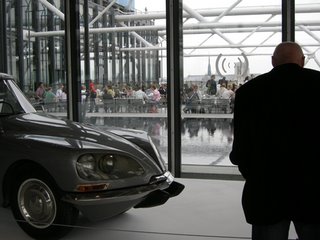
Gabriel Orozco, "La D.S." 1970
By the 4th course it hit me that this is not French, but Fusion cuisine! A newly constructed wall is placed in the middle of the room entitled ‘Free Space...” Carefully in the center is a Banksy-styled graffiti work by Mircea Cantor. Its preciousness irritated me in the name of Graffiti Art. The piece would have exponentially gained merit had it been sprayed on one of those glorious blue tubes on the exterior of the Pompidou. Her other work, a light box photo with the words ‘unpredictable future’ written on a misty window is a process yet to be exploited. I had an image of the artist directly connected with weather. She could only execute work in cold temperatures. The over-heated rooms creating condensation on the windows. Time would be critical. Her canvas available for a very short period of time. She would have to run from place to place writing temporal messages on store and car windows. Delivery is key. And even the other notable artist in this room, Jean-Luc Moulène cheats himself by installing a periodical entitled, ‘Le Tunnel’ as an object. This poetic work takes the form of newsprint, a beautiful nostalgic medium. Somehow the crate of stacked newspapers and each paper taped to the wall, lose the identity of the piece. A curatorial choice? Surely this couldn’t be the idea of the artist to re-CONtextualize his words and reverse his modus operandi.
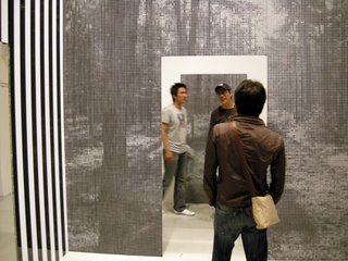
Daniel Buren and Xavier Veihan
"La Cabane Eclatée au Paysagés Fantômes" 2006-07
On the B-side we are welcomed with Chris Marker’s ‘Zapping Zone.’ Made 25 years after Nam June Paik’s television symphonies, nonetheless this media orchestra is a visual-audio mirror of split second information delivery. 35 years after the onset of the digital age, we witness how the brains of our children process information. Beauty would not need to be repeated, as we would find beauty in repetition. In Thomas Hirschorn’s ‘Outgrowth’ 2005 I feel human again. Like a taxidermist reconfiguring animals with malignant tumors, Hirschorn constructs paper globes each with their war-torn cancerous growths. Newspaper clippings hang under each shelf to provide reference of where and when each growth appeared. Anxiety is highlighted by the masking tape that crudely shapes each deformation. Light yet rich in subject, contemporary and reminiscent, reflective without pomp I could end the meal here. Perhaps mentally, emotionally, physically I did. The music played on for another good 6 courses. After this point, I was half listening.
Identity Room 8- a colored ghetto. Didn’t we do this in the late 80’s early 90’s? An honorable mention is Huang Yong Ping’s ‘Carte du Monde’ 2006-2046. A globe sitting naked in the corner is pealed like an orange. Its endless peal spreads across the wall. Like a palm-reader Huang pins MISfortunes to hotspots on localities.
Although there was endless chatter, I could catch a few smart dialogues. My interest lay in the hands of the more experienced and wiser. Hiroshi Sugimoto and Sophie Calle, much like Buren-Veihan and Matta-Clark/Huyghe teamed up and found a way to make memorable statements in a dizzying atmosphere. Sugimoto in his dreamy extreme slow shutter aesthetic would select his ’98 Eiffel Tower (oh yes, the show about Paris) and Calle’s 1979 journal entry ‘Tour Eiffel’ would leave as a pair. However another duo, Louis Bourgeois’ marble curved houses enclosed by Koo Jeong-a’s 1001 drawings was just plain wrong. Have we been reduced to the approach of matching the sofa with the painting? Artists, we can’t be pushed around like this!
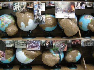
Thomas Hirschorn, "Outgrowth" 2005
So where are my peers? He-He Associates (Helen Evans and Heiko Hansen) an English and German duo installed in Paris are working on digital visualizations of nature rejuvenated and damaged. Had I not the postcard, I would have never found their piece installed in a small window, the view of Paris altered by a transparent digital screen communicating with ‘Airparif’ to measure the level of air pollution. I recall having seen something similar in a lab in Santa Barbara, when as a poor college student I was hired for $8/hour to go on a treadmill in a enclosed room as the air quality increased in pollutants. One could see the pollution levels on graphs, numbers, colors, etc. In the digital age the role of the artist has been rediscovered with many artists now collaborating with scientists. I could imagine the screen was pricey, but couldn’t help think that the project would be more effective installed in the café windows where people leisurely tried to enjoy the view. Again in a large exhibition and no fault of the individual artist, context is sacrificed and the works suffer.
The architecture/design room arrives unfashionably one hour late. However, the brilliance of Zaha Hadid is side-noted, the infrared hot air balloon interesting inside its trade show installation. Like most summer group exhibitions, this one also leaves you exhausted in search for the exit. As an experience, I did feel as if I were in a City- anonymous, sensory-charged, crowded, over-exposed. Surpassing my limit, I’m in great need of a digestive. Although stimulated, I’m happy that not all cities are like the ‘Airs de Paris’ and I head toward a quiet intimate corner of the Parisian café to take my espresso.
Thursday, August 09, 2007
PROGRAMMING OF GYEONGGIDO MUSEUM OF ART;
OPENING OF NAM JUNE PAIK EXHIBITION
Interview with Kim Hong-hee
About Gyeonggido Museum of Art and Nam June Paik Rhapsody in Video:
There is a new contemporary art museum in Gyeonggido, Korea. Gyeonggido surrounds Seoul and is one of the largest and most affluent provinces in Korea. As the first invited director of this museum, Kim Hong-hee speaks about her visions for the museum. Furthermore, as the artistic director for the KBS (Korean Broadcasting Station) 80th Anniversary Special Exhibition Nam June Paik Rhapsody in Video, she speaks about staging Paik’s artworks of the 90’s, his golden years.
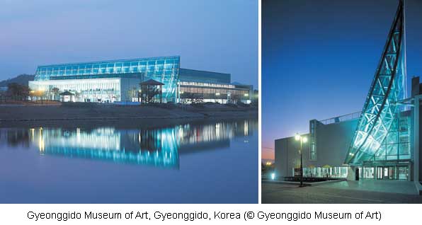
MC: Please talk about the local/global concerns for the Gyeonggido museum. As a local museum, how are you planning on shaping the museum’s goals and visions for the future?
MC: You mention the importance of the programming; would you talk more about that?
KHH: The main features of the exhibition will be an annual exhibition that is dedicated to exploring themes of the province such as the one we had this year, the sculpture garden and green project Line in Space: 2007 Sculpture Project, and then the goal is to develop the museum’s programming with project-based events, residencies, and international exchange programs. All of this is to create a national and international, local and global museum, which places activity and liveliness ahead of anything else. Furthermore, there are some things that are seasonal to consider, for example, the summer time is an important exhibition time for youngsters so this year, we are currently showing Charge Your Imagination exhibition which displays contemporary Korean artists with artworks that are visually and conceptually stimulating as well as with some artworks that can be touched and climbed on. Essentially, what makes the Gyeonggido Museum different is that the museum’s main focus and attention, the energy and resource, is on the programming, which will change each year and be worked on and researched. Hence, the museum is directed towards a movement forward.
MC: Many international museums house collections which are essentially the same (blockbuster pre-modern to modern artworks), how is this museum different, what does it house, and how will you maintain a program based museum rather than collection based museum?
KHH: The Gyeonggido Museum is a museum that focuses more on programming (active) and also intends to house a contemporary collection that fits the identity of the museum. The museum already has about 200 contemporary art works and we have currently provided touring exhibitions from this collection, which travels around Gyeonggido.
MC: Let’s talk about the Nam June Paik exhibition at KBS. I found your exhibition interesting since it was exhibited at KBS rather than a museum and because it was a site-specific exhibition, can you speak more about the exhibition layout, staging, and theatrics of Paik’s artwork for the exhibition Rhapsody in Video?
MC: What were the difficulties in putting this exhibition together, what do you believe is the highlight, and what is the general response of it?
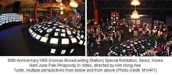
HKK: The most difficult aspect of the exhibition planning was utilizing a space that was not originally intended for artwork display. The highlight of the exhibition, other than the absolutely gigantic turtle piece, is the three satellite pieces that are projected side by side so that people can walk through them to watch it one at a time or at once simultaneously. Since this is the KBS’s 80th anniversary, and since KBS was one of Paik’s supporting broadcasting stations, it made sense that Paik is celebrated this way for the occasion. The public and media response is positive, the critics like it too.
Gyeonggido Museum of Art
80th Anniversary KBS (Korean Broadcasting Station) Special Exhibition
Nam June Paik Rhapsody in Video
Exhibition at Special Exhibition Hall in KBS New Bld., Yeoido, Seoul
July 27 – December 30, 2007
http://www.kbsnamjunepaik.com/
The 6th Gwangju Biennale 2006
Fever Variations
Artist Organized Art
as seen in:

help by linking us (click in box, copy code, paste code into your site or blog page)
http://artistorganizedart.org
Makes Example: http://artistorganizedart.org
XML ::.. bookmark this page: del.icio.us Furl reddit Yahoo MyWeb
Get More Involved: Donate Now | Log In | Sign Up Now | Subscribe | About Us